Human beings possess an extraordinary capacity to adapt to their environment and to their immediate surroundings. Of all the types of energy that humans can utilize, light is the most important. Light is a key element in our capacity to see, and it is necessary to appreciate the form, the colour and the perspective of the objects that surround us in our daily lives. Most of the information we obtain through our senses we obtain through sight—close to 80%. Very often, and because we are so used to having it available, we take it for granted. We should not fail to keep in mind, however, that aspects of human welfare, like our state of mind or our level of fatigue, are affected by illumination and the colour of the things that surround us. From the point of view of safety at work, visual capacity and visual comfort are extraordinarily important. This is because many accidents are due to, among other reasons, illumination deficiencies or errors made by the worker because he or she finds it hard to identify objects or the risks associated with machinery, conveyances, dangerous containers and so on.
Visual disorders associated with deficiencies in the illumination system are common in the workplace. Due to the ability of sight to adapt to situations with deficient lighting, these aspects are sometimes not considered as seriously as they should be.
The correct design of an illumination system should offer the optimal conditions for visual comfort. For the attainment of this goal an early line of collaboration between architects, lighting designers and those responsible for hygiene at the worksite should be established. This collaboration should precede the beginning of the project, to avoid errors that would be difficult to correct once the project is completed. Among the most important aspects that should be kept in mind are the type of lamp that will be used and the lighting system that will be installed, the distribution of luminance, illumination efficiencies and the spectral composition of light.
The fact that light and colour affect the productivity and the psycho-physiological well-being of the worker should encourage the initiatives of illumination technicians, physiologists and ergonomists, to study and determine the most favourable conditions of light and colour at each work station. The combination of illumination, the contrast of luminances, the colour of light, the reproduction of colour or the selection of colours are the elements that determine colour climate and visual comfort.
Factors that Determine Visual Comfort
The prerequisites that an illumination system must fulfil in order to provide the conditions necessary for visual comfort are the following:
- uniform illumination
- optimal luminance
- no glare
- adequate contrast conditions
- correct colours
- absence of stroboscopic effect or intermittent light.
It is important to consider light in the workplace not only by quantitative criteria, but also by qualitative criteria. The first step is to study the work station, the precision required of the tasks performed, the amount of work, the mobility of the worker and so on. Light should include components both of diffuse and of direct radiation. The result of the combination will produce shadows of greater or lesser intensity that will allow the worker to perceive the form and position of objects at the work station. Annoying reflections, which make it harder to perceive details, should be eliminated, as well as excessive glare or deep shadows.
The periodic maintenance of the lighting installation is very important. The goal is to prevent the ageing of lamps and the accumulation of dust on the luminaries that will result in a constant loss of light. For this reason it is important to select lamps and systems that are easy to maintain. An incandescent light bulb maintains its efficiency until the moments before failure, but this is not the case with fluorescent tubes, which may lower their output down to 75% after a thousand hours of use.
Levels of illumination
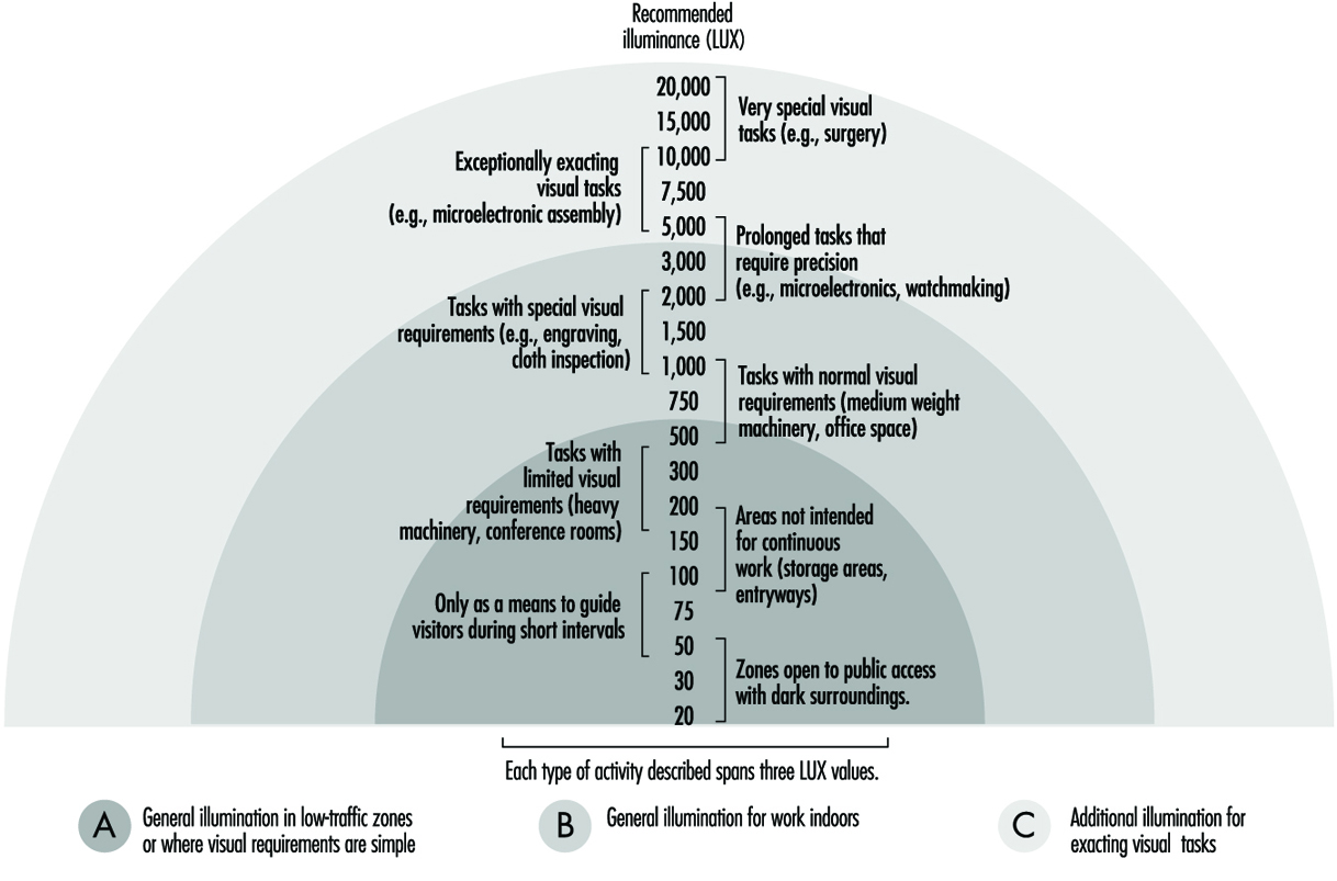
Each activity requires a specific level of illumination in the area where the activity takes place. In general, the higher the difficulty for visual perception, the higher the average level of illumination should be as well. Guidelines for minimal levels of illumination associated with different tasks exist in various publications. Concretely, those listed in figure 1 have been gleaned from European norms CENTC 169, and are based more on experience than on scientific knowledge.
Figure 1. Levels of illumination as a function of tasks performed
The level of illumination is measured with a luxometer that converts luminous energy into an electrical signal, which is then amplified and offers an easy reading on a calibrated scale of lux. When selecting a certain level of illumination for a particular work station the following points should be studied:
- the nature of the work
- reflectance of the object and of the immediate surroundings
- differences with natural light and the need for daytime illumination
- the worker’s age.
Units and magnitudes of illumination
Several magnitudes are commonly used in the field of illumination. The basic ones are:
Luminous flux: Luminous energy emitted per unit of time by a light source. Unit: lumen (lm).
Luminous intensity: Luminous flux emitted in a given direction by a light that is not equally distributed. Unit: candela (cd).
Level of illumination: Level of illumination of a surface of one square metre when it receives a luminous flux of one lumen. Unit: lux = lm/m2.
Luminance or photometric brilliance: Is defined for a surface in a particular direction, and is the relation between luminous intensity and the surface seen by an observer situated in the same direction (apparent surface). Unit: cd/m2.
Contrast: Difference in luminance between an object and its surroundings or between different parts of an object.
Reflectance: Proportion of light that is reflected by a surface. It is a non-dimensional quantity. Its value ranges between 0 and 1.
Factors that affect the visibility of objects
The degree of safety with which a task is executed depends, in large part, on the quality of illumination and on visual capacities. The visibility of an object can be altered in many ways. One of the most important is the contrast of luminances due to reflection factors, to shadows, or to colours of the object itself, and to the reflection factors of colour. What the eye really perceives are the differences of luminance between an object and its surroundings, or between different parts of the same object. Table 1 lists the contrasts between colours in descending order.
The luminance of an object, of its surroundings, and of the work area influence the ease with which an object is seen. It is therefore of key importance that the area where the visual task is performed, and its surroundings, be carefully analysed.
Table 1. Colour contrasts
|
Colour contrasts in descending order |
|
|
Colour of the object |
Colour of the background |
|
Black |
Yellow |
|
Green |
White |
|
Red |
White |
|
Blue |
White |
|
White |
Blue |
|
Black |
White |
|
Yellow |
Black |
|
White |
Red |
|
White |
Green |
|
White |
Black |
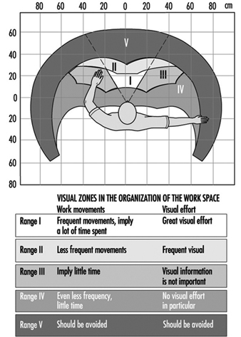
The size of the object that must be observed, which may be adequate or not depending on the distance and the angle of vision of the observer, is another factor. These last two factors determine the arrangement of the work station, classifying different zones according to their ease of vision. We can establish five zones in the work area (see figure 2).
Figure 2. Distribution of visual zones in the work station
Another factor is the time frame during which vision occurs. The time of exposure will be greater or smaller depending on whether the object and the observer are static, or whether one or both of them are moving. The adaptive capacity of the eye to adjust automatically to the different illuminations of objects can also have considerable influence on visibility.
Light distribution; glare
Key factors in the conditions that affect vision are the distribution of light and the contrast of luminances. In so far as the distribution of light is concerned, it is preferable to have good general illumination instead of localized illumination in order to avoid glare. For this reason, electrical accessories should be distributed as uniformly as possible in order to avoid differences in luminous intensity. Constant shuttling through zones that are not uniformly illuminated causes eye fatigue, and with time this can lead to reduced visual output.
Glare is produced when a brilliant source of light is present in the visual field; the result is a diminution in the capacity to distinguish objects. Workers who suffer the effects of glare constantly and successively can suffer from eye strain as well as from functional disorders, even though in many cases they are not aware of it.
Glare can be direct when its origin is bright sources of light directly in the line of vision, or by reflection when light is reflected on surfaces with high reflectance. The factors involved in glare are:
- Luminance of the source of light: The maximum tolerable lumi nance by direct observation is 7,500 cd/m2. Figure 3 shows some of the approximate values of luminance for several sources of light.
- Location of the source of light: This kind of glare occurs when the source of light is within a 45-degree angle of the observer’s line of sight, and will be minimized to the degree that the source of light is placed beyond that angle. Ways and methods of avoiding direct and reflective glare can be seen in the following figures (see figure 4).
Figure 3. Approximate values of luminance
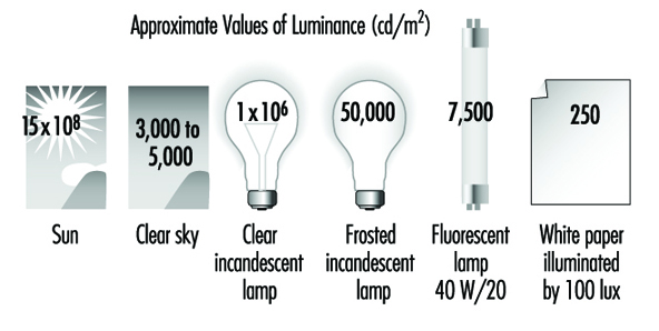
Figure 4. Factors that affect glare
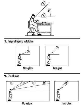
In general, there is more glare when sources of light are mounted at lower elevations or when installed in large rooms, because sources of light in large rooms or sources of light that are too low can easily fall within the angle of vision that produces glare.
3. Distribution of luminance among different objects and surfaces: The greater the differences in luminance are among the objects within the field of vision, the greater will be the glare created and the greater will be the deterioration in the capacity to see due to the effects on the adaptive processes of sight. The maximum recommended luminance disparities are:
- visual task—work surface: 3:1
- visual task—surroundings: 10:1
4. Time frame of the exposure: Even light sources with a low luminance can cause glare if the length of the exposure is prolonged too much.
Avoiding glare is a relatively simple proposition and can be achieved in different ways. One way, for example, is by placing grilles under the sources of illumination, or by using enveloping diffusers or parabolic reflectors that can direct light properly, or by installing the sources of light in such a way that they will not interfere with the angle of vision. When designing the work site, the correct distribution of luminance is as important as the illumination itself, but it is also important to consider that a distribution of luminance that is too uniform makes the three-dimensional and spatial perception of objects more difficult.
Lighting Systems
The interest in natural illumination has increased recently. This is due less to the quality of illumination it affords than to the well-being that it provides. But since the level of illumination from natural sources is not uniform, an artificial lighting system is required.
The most common lighting systems used are the following:
General uniform illumination
In this system light sources are spread out evenly without regard to the location of the work stations. The average level of illumination should be equal to the level of illumination required for the task that will be carried out. These systems are used mainly in workplaces where work stations are not fixed.
It should conform to three fundamental characteristics: The first is to be equipped with anti-glare devices (grilles, diffusers, reflectors and so on). The second is that it should distribute a fraction of the light toward the ceiling and the upper part of the walls. And the third is that the light sources should be installed as high as possible, to minimize glare and achieve illumination that is as homogeneous as possible. (See figure 5)
Figure 5. Lighting systems
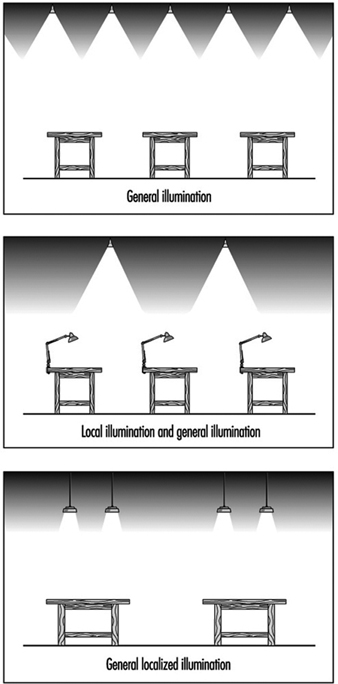
This system tries to reinforce the general illumination scheme by placing lamps close to the work surfaces. These types of lamps often produce glare, and reflectors should be placed in such a way that they block the source of light from the direct sight of the worker. The use of localized illumination is recommended for those applications where visual demands are very critical, such as levels of illumination of 1,000 lux or greater. Generally, visual capacity deteriorates with the age of the worker, which makes it necessary to increase the level of general illumination or to second it with localized illumination. This phenomenon can be clearly appreciated in figure 6.
Figure 6. Loss of visual acuity with age

General localized illumination
This type of illumination consists of ceiling sources distributed with two things in mind—the illumination characteristics of the equipment and the illumination needs of each work station. This type of illumination is indicated for those spaces or work areas that will require a high level of illumination, and it requires knowing the future location of each work station in advance of the design stage.
Colour: Basic Concepts
Selecting an adequate colour for a worksite contributes a great deal to the efficiency, safety and general well-being of the employees. In the same way, the finish of the surfaces and of the equipment found in the work environment contributes to creating pleasant visual conditions and a pleasant work environment.
Ordinary light consists of electromagnetic radiations of different wavelengths that correspond to each of the bands of the visible spectrum. By mixing red, yellow and blue light we can obtain most of the visible colours, including white. Our perception of the colour of an object depends on the colour of the light with which it is illuminated and on the way the object itself reflects light.
Lamps can be classified into three categories depending on the appearance of the light they emit:
- colour with a warm appearance: a white, reddish light recommended for residential use
- colour with intermediate appearance: a white light recommended for worksites
- colour with a cold appearance: a white, bluish light recommended for tasks that require a high level of illumination or for hot climates.
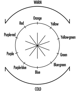
Colours may also be classified as warm or cold according to their tonality (see figure 7).
Figure 7. Tonality of "warm" and "cold" colours
Contrast and temperature of different colours
Colour contrasts are influenced by the colour of the light selected, and for that reason the quality of illumination will depend on the colour of the light chosen for an application. The selection of the colour of light to be used should be made based on the task that will be carried out under it. If the colour is close to white, the rendition of colour and the diffusion of light will be better. The more light approaches the red end of the spectrum the worse the reproduction of colour will be, but the environment will be warmer and more inviting.
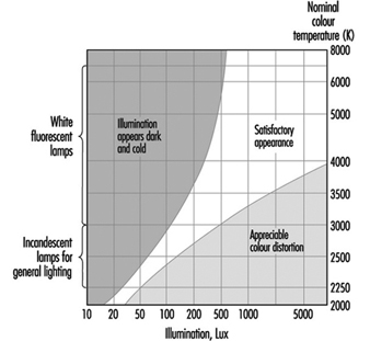
The colour appearance of illumination depends not only on the colour of light, but also on the level of luminous intensity. A colour temperature is associated with the different forms of illumination. The sensation of satisfaction with the illumination of a given environment depends on this colour temperature. In this way, for example, a 100 W incandescent filament light bulb has a colour temperature of 2,800 K, a fluorescent tube has a colour temperature of 4,000 K and an overcast sky has a colour temperature of 10,000 K.
Kruithof defined, through empirical observations, a diagram of well-being for different levels of illumination and colour temperatures in a given environment (see figure 8). In this way, he demonstrated that it is possible to feel comfortable in certain environments with low levels of illumination if the colour temperature is also low—if the level of illumination is one candle, for example, with a colour temperature of 1,750 K.
Figure 8. Comfort diagram as a function of illumination and colour temperatures
The colours of electric lamps can be subdivided into three groups related to their colour temperatures:
- daylight white—around 6,000 K
- neutral white—around 4,000 K
- warm white—around 3,000 K
Combination and selection of colours
The selection of colours is very relevant when we consider it together with those functions where identifying the objects that must be manipulated is important. It is also relevant when delimiting avenues of communication and in those tasks that require sharp contrast.
The selection of tonality is not as important a question as the selection of the proper reflective qualities of a surface. There are several recommendations that apply to this aspect of work surfaces:
Ceilings: The surface of a ceiling should be as white as possible (with a reflection factor of 75%), because light will then reflect from it in a diffuse way, dissipating darkness and reducing the glare from other surfaces. This will also mean a savings in artificial lighting.
Walls and floors: The surfaces of walls at eye level can produce glare. Pale colours with reflective factors of 50 to 75% tend to be adequate for walls. While glossy paints tend to last longer than matte colours, they are more reflective. Walls should therefore have a matte or semi-gloss finish.
Floors should be finished in slightly darker colours than walls and ceilings to avoid glare. The reflective factor of floors should be between 20 and 25%.
Equipment: Work surfaces, machinery and tables should have reflective factors of between 20 and 40%. Equipment should have a lasting finish of pure colour—light browns or greys—and the material should not be shiny.
The proper use of colours in the work environment facilitates well-being, increases productivity and can have a positive impact on quality. It can also contribute to better organization and the prevention of accidents.
There is a generalized belief that whitening the walls and ceilings and supplying adequate levels of illumination is all that can possibly be done as far as the visual comfort of employees is concerned. But these comfort factors can be improved by combining white with other colours, thus avoiding the fatigue and the boredom that characterize monochromatic environments. Colours also have an effect on a person’s level of stimulation; warm colours tend to activate and relax, while cold colours are used to induce the individual to release or liberate his or her energy.
The colour of light, its distribution, and the colours used in a given space are, among others, key factors that influence the sensations a person feels. Given the many colours and comfort factors that exist, it is impossible to set precise guidelines, especially considering that all these factors must be combined according to the characteristics and the requirements of a particular work station. A number of basic and general practical rules can be listed, however, that can help create a liveable environment:
- Bright colours produce comfortable, stimulating and serene feelings, while dark colours tend to have a depressing effect.
- Sources of warm-coloured light help reproduce warm colours well. Warm-coloured objects are more pleasing to the eye in warm light than in cold light.
- Clear and dull colours (like pastels) are very appropriate as background colours, while objects should have rich and saturated colours.
- Warm colours excite the nervous system and give the sensation that temperature is rising.
- Cold colours are preferable for objects. They have a calming effect and can be used to produce the effect of curvature. Cold colours help create the sensation that temperature is dropping.
- The sensation of colour of an object depends on the background colour and on the effect of the light source on its surface.
- Environments that are physically cold or hot can be tempered by using warm or cold lighting, respectively.
- The intensity of a colour will be inversely proportional to the part of the normal visual field that it occupies.
- The spatial appearance of a room can be influenced by colour. A room will seem to have a lower ceiling if its walls are painted a bright colour and the floor and ceiling are darker, and it will seem to have a higher ceiling if the walls are darker and the ceiling is bright.
Identifying objects through colour
The selection of colours can influence the effectiveness of lighting systems by influencing the fraction of light that is reflected. But colour also plays a key role when it comes to identifying objects. We can use brilliant and eye-catching colours or colour contrasts to highlight situations or objects that require special attention. Table 2 lists some of the factors of reflection for different colours and materials.
Table 2. Reflection factors of different colours and materials illuminated with white light
|
Colour/material |
Reflection factor (%) |
|
White |
100 |
|
White paper |
80–85 |
|
Ivory, lime-yellow |
70–75 |
|
Bright yellow, light ochre, light green, pastel blue, light pink, cream |
60–65 |
|
Lime-green, pale gray, pink, orange, blue-gray |
50–55 |
|
Blond wood, blue sky |
40–45 |
|
Oak, dry concrete |
30–35 |
|
Deep red, leaf-green, olive-green, meadow-green |
20–25 |
|
Dark blue, purple |
10–15 |
|
Black |
0 |
In any case, identification by colour should be employed only when it is truly necessary, since identification by colour will work properly only if there are not too many objects that are highlighted by colour. The following are some recommendations for identifying different elements by colour:
- Fire and safety equipment: It is advisable to identify this equipment by placing a recognizable graphic on the nearest wall so that it can be found quickly.
- Machinery: The colouring of stop or emergency devices with bright colours on all machinery is critical. It is also advisable to mark with colour the areas that need lubrication or periodic maintenance, which can add ease and functionality to these procedures.
- Tubing and pipes: If they are important or carry dangerous substances the best advice is to colour them completely. In some cases it may be enough to colour only a line along their length.
- Stairways: In order to make descent easier, one band for every step is preferable to several.
- Risks: Colour should be used to identify a risk only when the risk cannot be eliminated. Identification will be much more effective if it is carried out according to a predetermined colour code.